**To comply with my non-disclosure agreement, I have omitted and obfuscated confidential information in this case study.

"ARTikel" is a small company that designs unique items for the home with a Dutch influence.
Role: UX Designer
Client: ARTikel
Situation:
The client's goal was straightforward: Artikel was seeking a re-branding of their current site as well as a more dynamic, streamlined UX and interface for a better shopping experience. The implementation of "mega-menus" similar to any online store was imperative for their new site. Their previous structure wasn't based on a Restoration Hardware or Macy's site map. And this is the model we pursued.
I created an experience that uses contemporary web technologies working consistently across all devices with responsive design.
Problem:
The client's current site didn't allow enough detail in a streamlined UI/UX to describe their products. It was also difficult to navigate within each section to acccomodate the short attention span of online shoppers.
STRATEGY:
Creative Brief
The first step I always take when working on an independent project is to sit down with the client and begin a discussion with a creative brief. This allows me protection from seemingly undiscussed changes and, of course, a framework to begin.


So I asked ARTikel in the Brief questions such as:
- What are the Primary, Secondary, & Long Term Goals of the site?
- What is the emotional center of your site?
- What benefits can your site provide?
- Who are your main competitors?
- What are your company’s main strengths & weaknesses?
DISCOVERY:
Mood Board
Though not the individual in charge of the visual design of the site, nevertheless I presented a mood board along with a logo design. They loved my rebranding concept, and went with the ideas I presented with color, shape, and themes.

ANALYSIS:
Step #1: Visitor Journeys
My next step is working on my own in my office and creating visitor personas. For ARTikel, the following are archetypal patrons/visitors to the site:
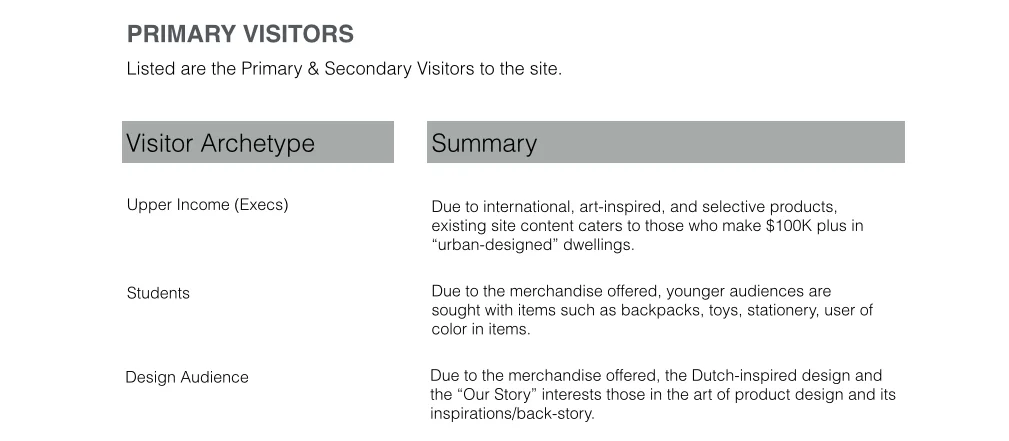
I imagined 3 visitor scenarios to the site:
Visitor Journey #1
Proposed Navigation Flow: Upper Income (Execs) via organic search for “office supplies”: to newsletter

Visitor Journey #2
Proposed Navigation Flow: Student looking for innovative school items such as stationery, backpack, writing tools via direct URL: to social media

Visitor Journey #3
Proposed Navigation Flow: “Design Aficionando" sees booth at trade show: to share

Step #2: Overarching Content Thread
Creating a content diagram gave the client an understanding of the content in the site and its relative scale. The largest amount of content, being the overview for the site, is of the products. Secondary is the branding, and the Call-To-Action (Purchase) as the most important, functional core.

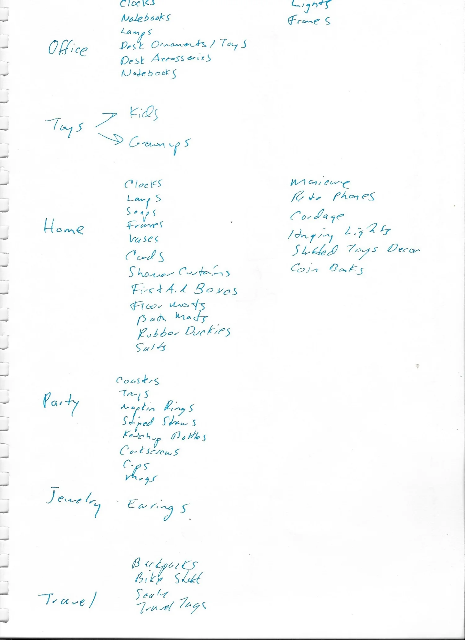
Step #3: Site Map
The site map consists of many categories of products under Shopping. Only a few are presented here from a mega-menu of subjects with a myriad of subpage content. The site map also consists of the 3 templates I had designed, with the orange template being the Call-To-Action (Purchase).
INITIAL DESIGN:
Several iterations of different types of homepages, product pages, and detail pages were sketched for responsive design on mobile devices: all with the end user goal of an immediate Call-To-Action.
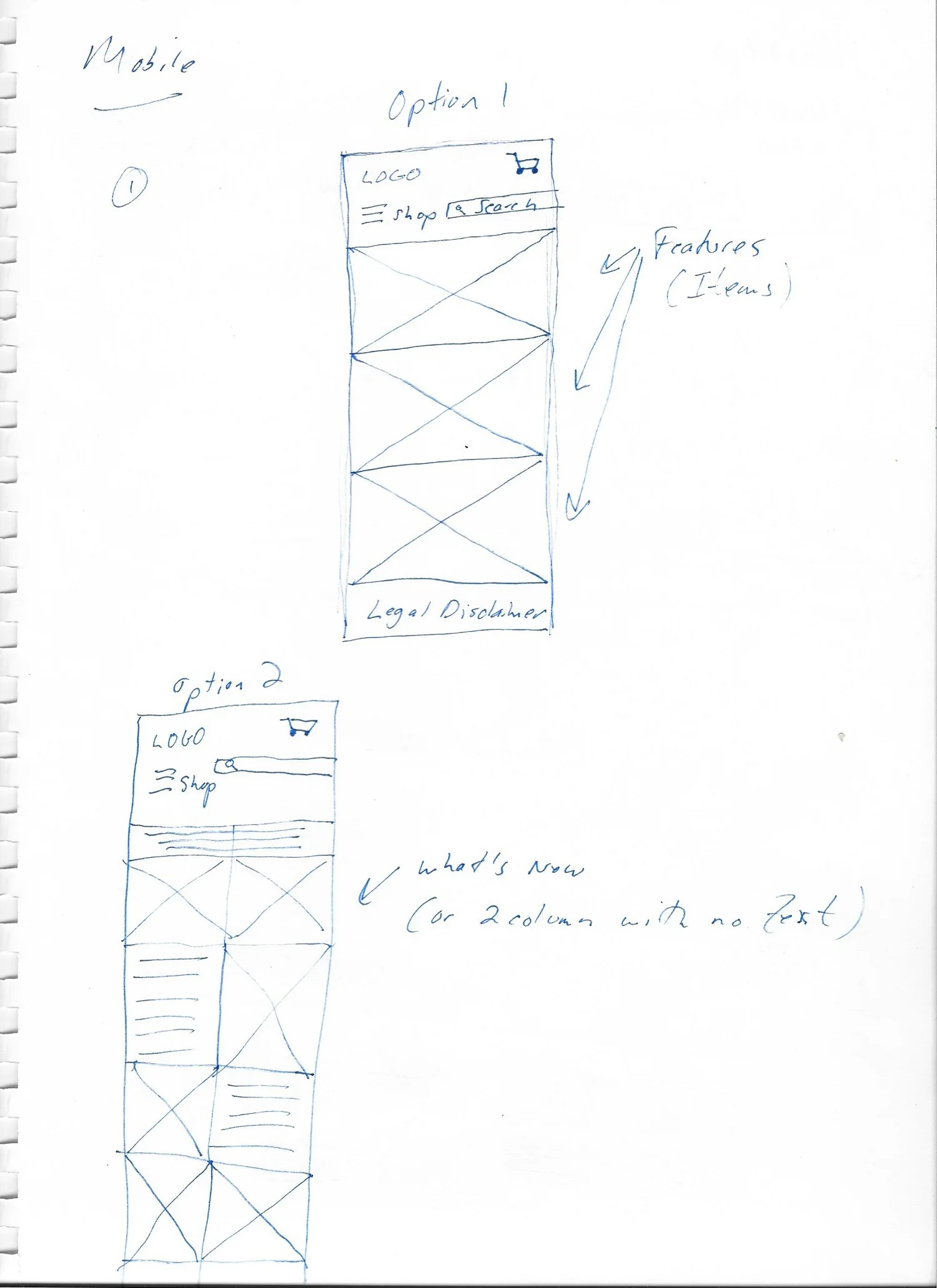
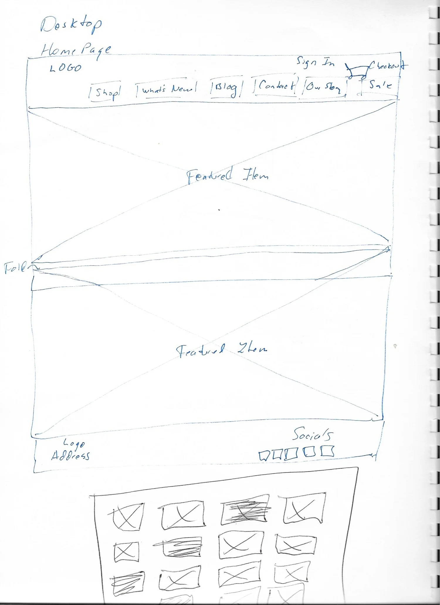
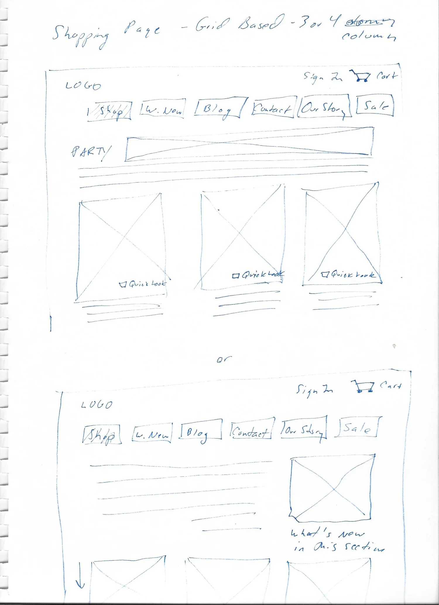
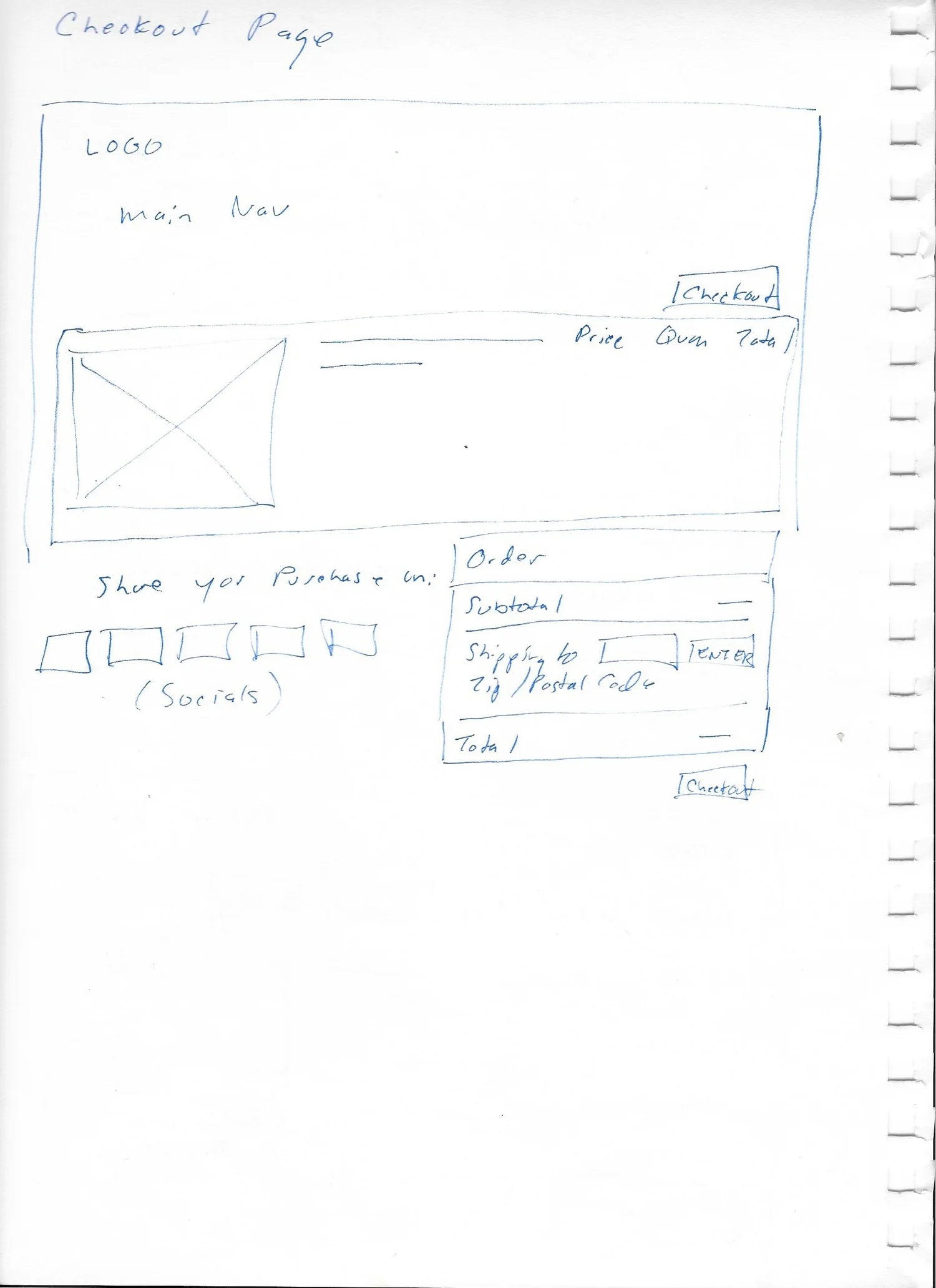
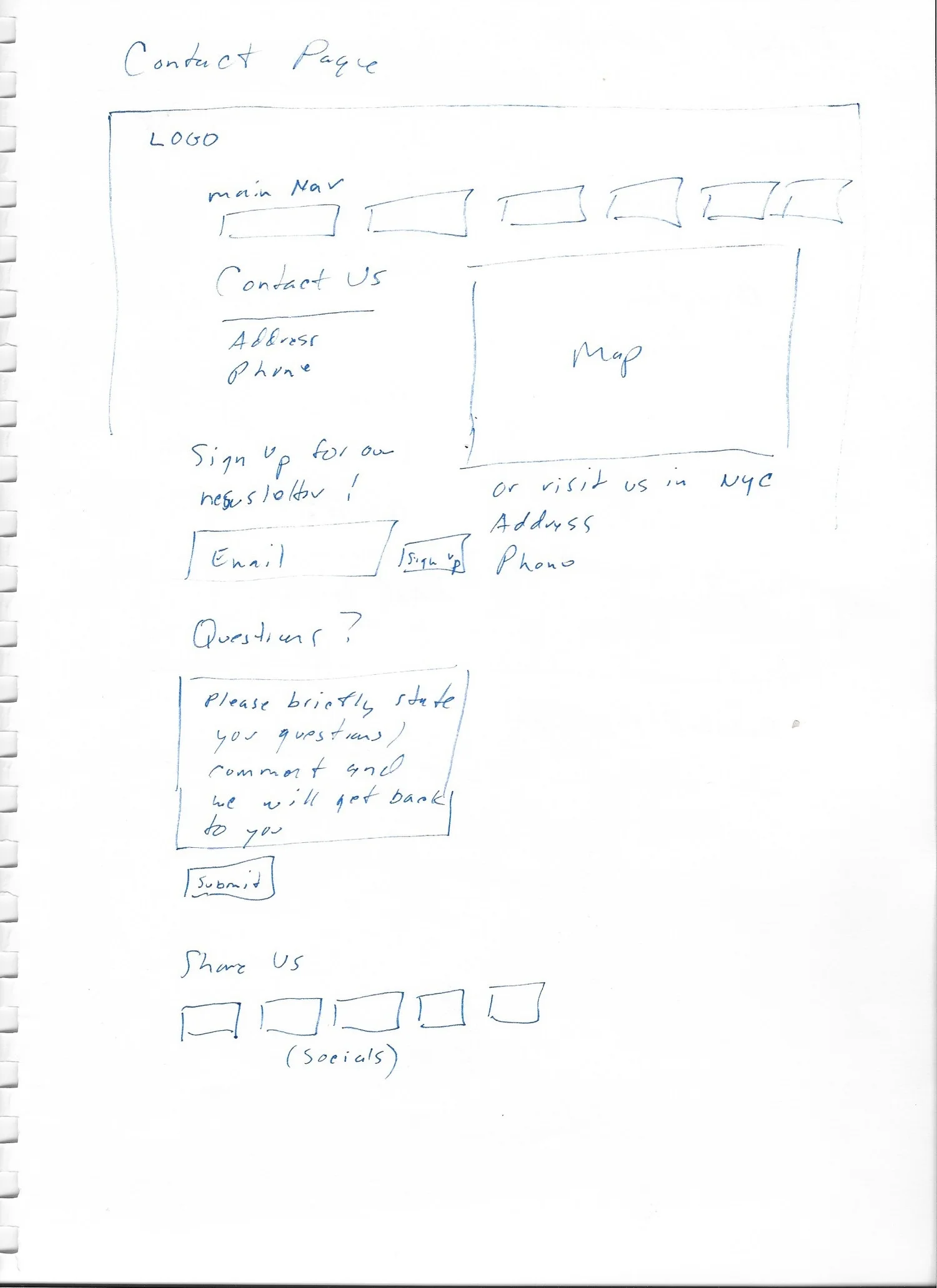
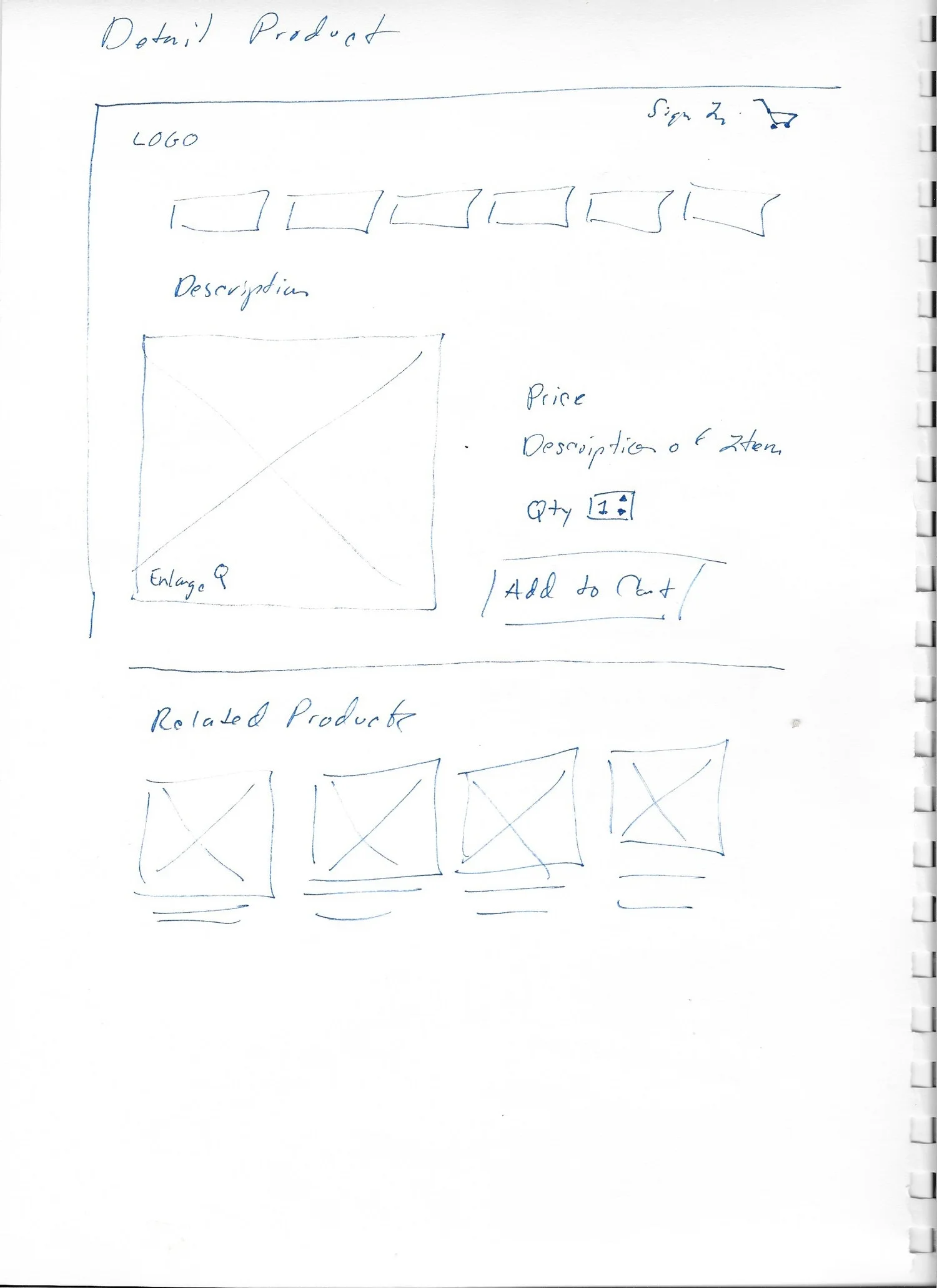
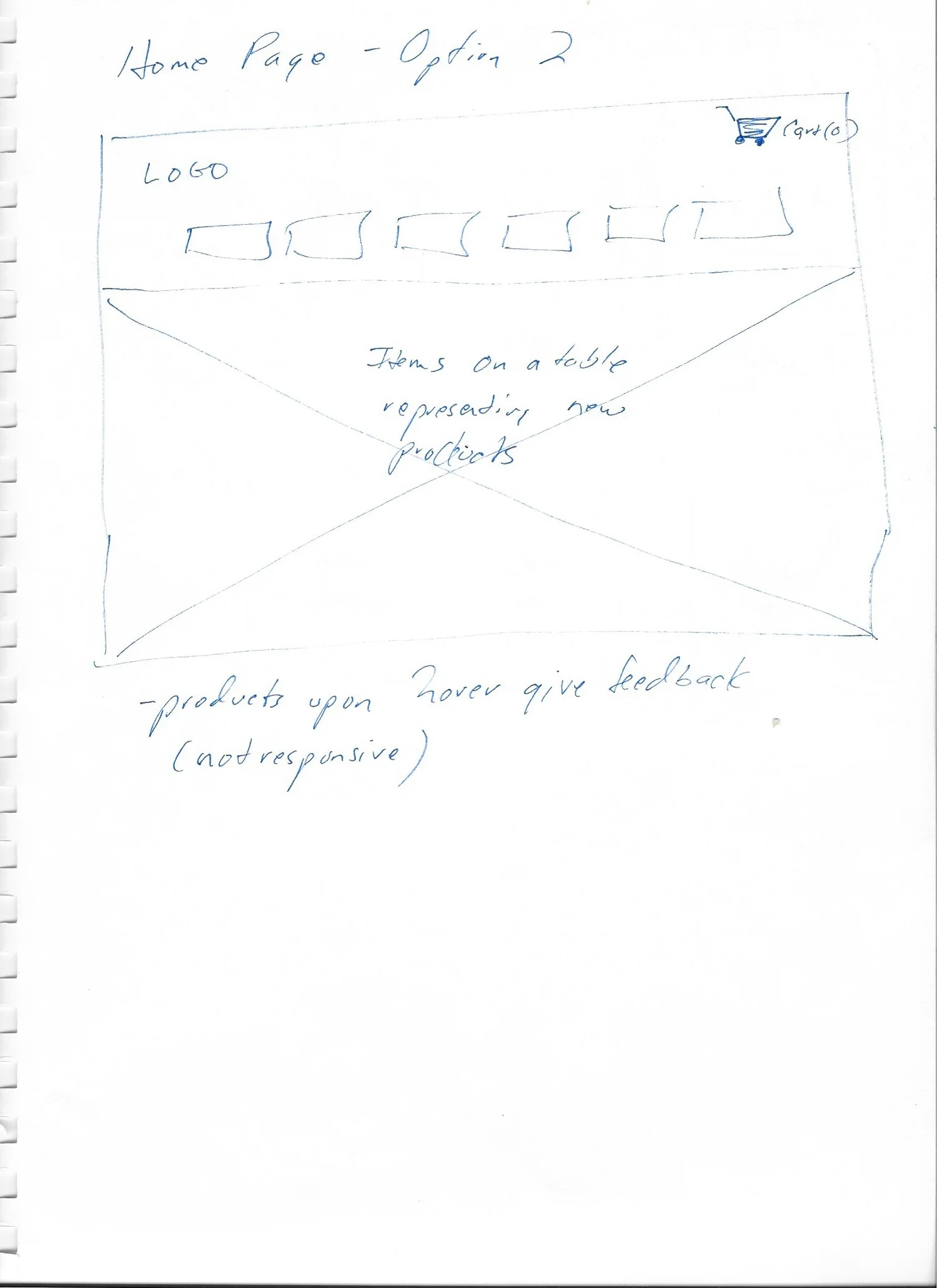
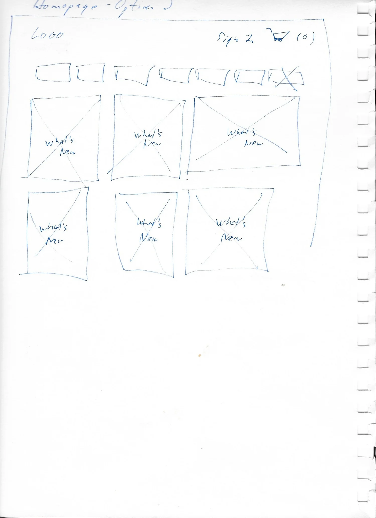
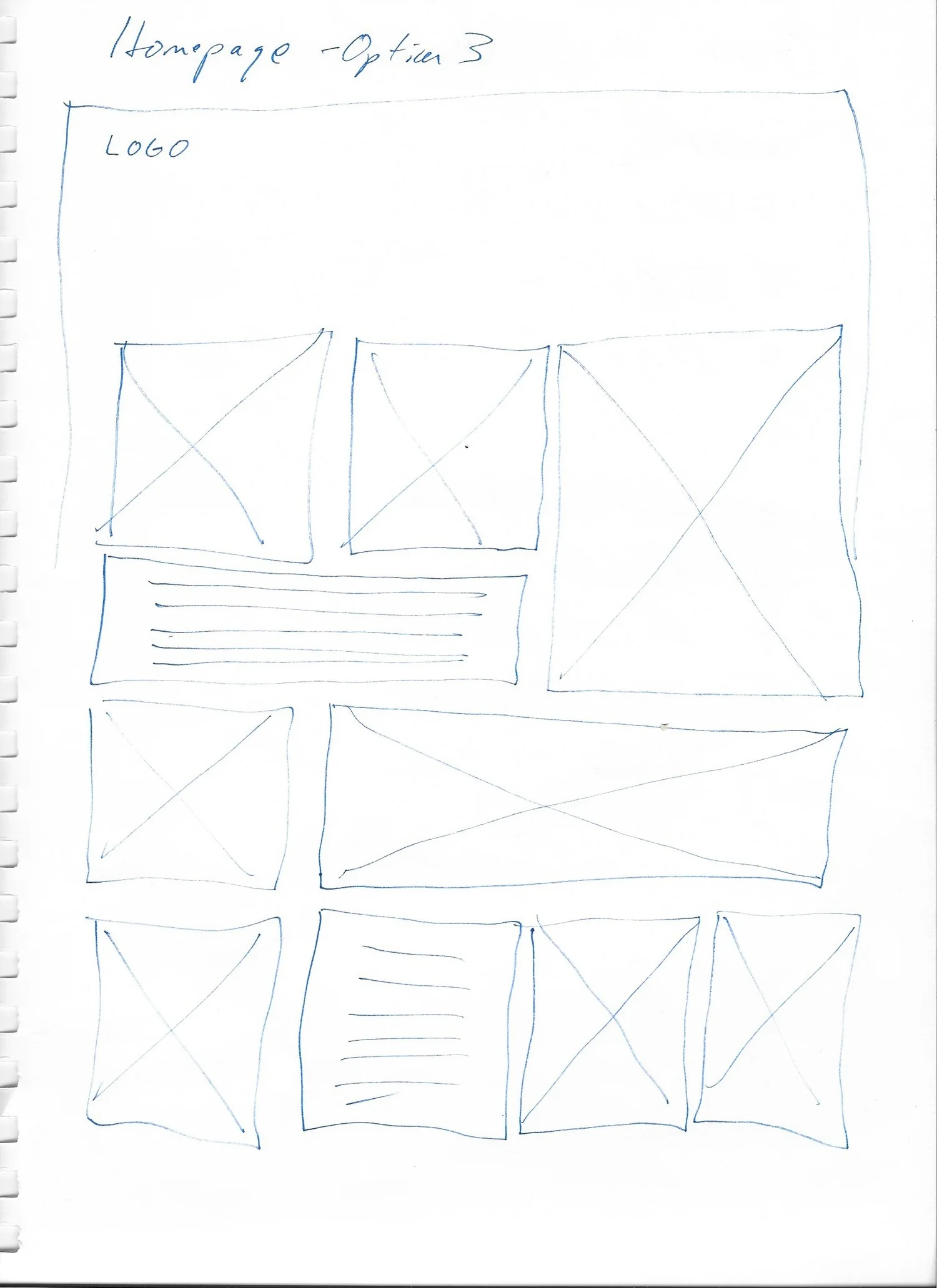
Low-Fidelity Wireframes
For the UI/UX of the site, the following are 4 pages of 3 templates designed.


PRODUCTION:
These wireframes were approved by their 3rd version and were handed off to the developer on May 2, 2015 (the time of this writing). After my talks with the development team and the stakeholders for the production phase, I'm looking forward to seeing the site live in approximately 1 month.